Project Details
PROJECT OVERVIEW
Finni is a brand identity and website design project for an early-stage EdTech startup entering a crowded and competitive market. This is sample template text - be sure to edit.
The goal was to create a modern, flexible identity system that could clearly communicate the product’s value while feeling approachable to learners and credible to investors. The project focused on building a strong foundation — from brand strategy to a live website — that could scale with the company as it grows.
challenges
At an early stage, the startup lacked a clear and consistent visual identity. This is sample template text - be sure to edit.
Their existing materials felt generic and didn’t reflect the product’s vision or personality. In a space where many EdTech platforms look and sound similar, this made it difficult to stand out or build trust with users.
The challenge was to create a brand that felt distinct and modern, while still being simple enough to adapt across different touchpoints as the product evolved.
solutions
The approach started with defining the brand before designing it. This is sample template text - be sure to edit.
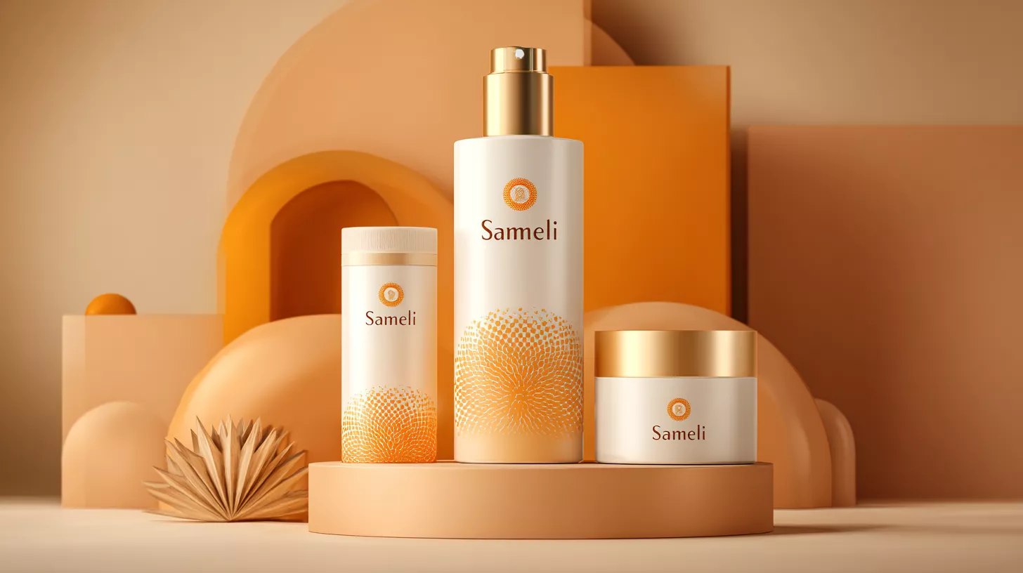
A cohesive identity system was developed, including logo, typography, colour palette, and visual guidelines — designed to be both expressive and scalable. The direction leaned towards a clean, modern aesthetic with subtle warmth to make the experience feel more human and less institutional.
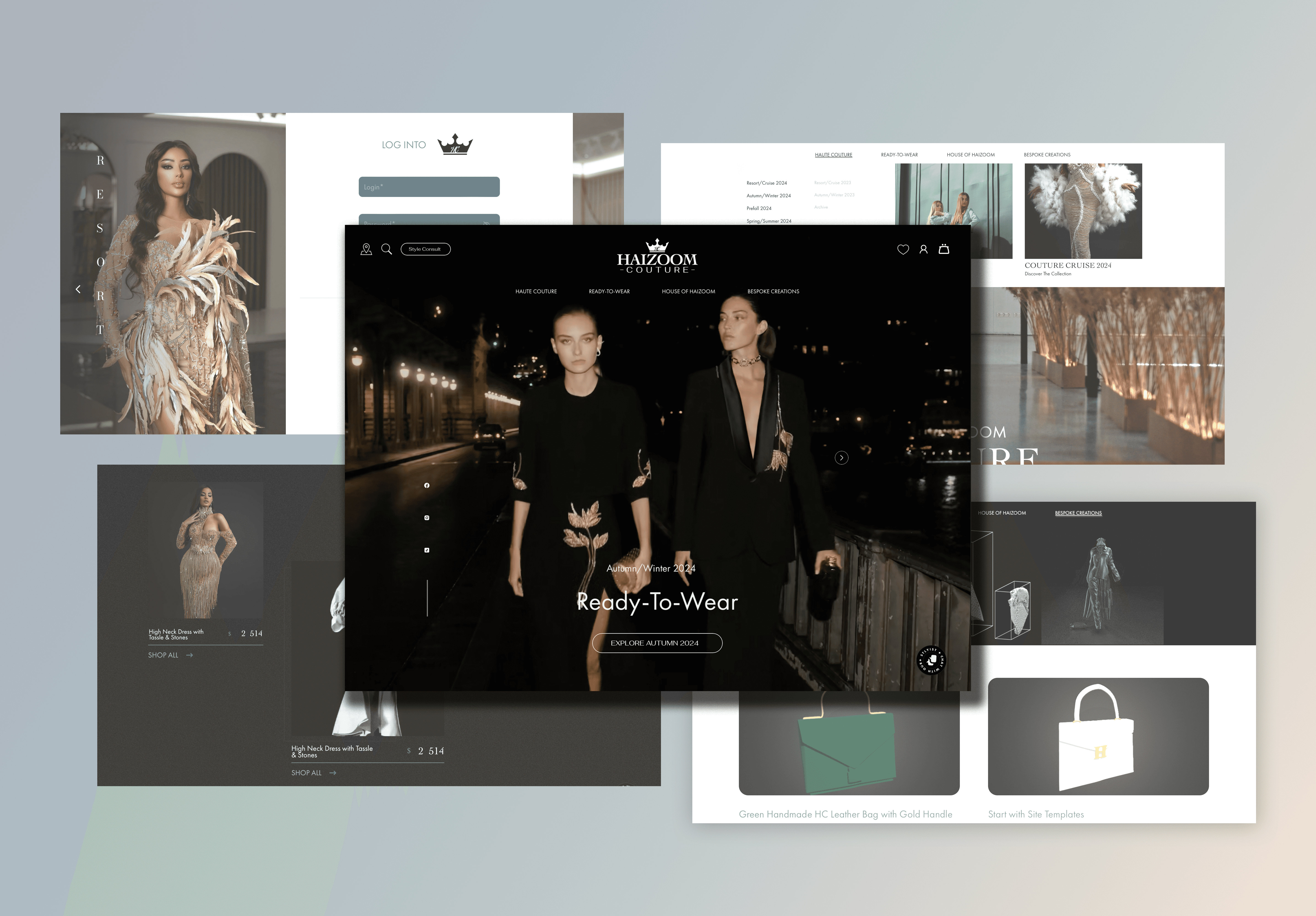
This identity was then extended into a responsive website, focusing on clear messaging, structured content, and a strong visual hierarchy to guide users through the product’s value.


impact
The new identity gave Lumio a clear and confident presence.
With a consistent visual language in place, the team was able to present the product more effectively across their website, pitch materials, and early marketing efforts. The brand felt more intentional and differentiated, helping build early trust with both users and stakeholders.
The website also improved how the product was understood, making it easier for visitors to quickly grasp what Lumio offers and why it matters.
50%
Increase in time spent on website pages
2x
Improvement in clarity of product understanding
3
Weeks to launch brand and website from scratch
85%
Positive first-impression feedback